Ranking the Minnesota Twins 2024 Uniforms

With the Minnesota Twins City Connect uniforms dropping on Monday morning, the franchise now has five different offerings to rotate through this season. The wear dates for the City Connect uniforms are set in stone. They’ll tout them for the first time on Friday but when they wear their other uniforms often rotates.
How well the City Connect uniforms hold up over the next couple of seasons remains to be seen, but the Twins are hoping they age like fine wine because the initial reviews were not kind. Coming out of a recent rebrand, though, the Twins have a solid stable of offerings.
Of course players have preferences, and while not all jive with the fans, but the Twins’ five rotating uniforms seem to play pretty well, even if they aren’t the “all-time” favorite of older fans, who miss pinstripes or differently shaped ‘Ms’.
Ranking 2024 Minnesota Twins uniforms from worst to best
— Minnesota Twins (@Twins) November 18, 2022
But today, we are going to rank the current roster of Minnesota Twins’ uniforms from worst to best. Feel free to let me know how terrible my choices are in any of our social media comment sections and choose your favorite Twins uniform in the poll underneath my rankings.
5. Alternate Twins Uniform

A navy top with the Minnesota wordmark across the chest, there is just nothing that stands out about this configuration. The navy is a traditional Minnesota Twins color, and the uniform isn’t going to ruffle any feathers.
But it certainly doesn’t do anything to move the needle, either. It just kind of exists as the team’s main home uniform. Having the newly designed “M” logo also gets it a slight downgrade, because the old TC logo was better.
4. City Connect (2024)
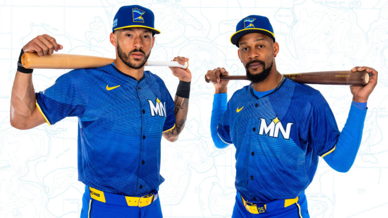
Unveiled in June 2024, the City Connect uniform is dubbed “The Ripple Effect.” If nothing else, it is certain to send waves through Twins Territory. There are slight hues of a traditional navy here, but the royal blue dominates the scheme and the bright yellow seems incredibly forced.
Nice setup this morning at the #MNTwins @NewEraCap Team Store.
— Ted (@tlschwerz) June 10, 2024
Adult jerseys run $199-$479
Stretch fit caps $45 with fitteds upwards of that. pic.twitter.com/FnnOQWhyN5
The secondary logo’s on both the cap and sleeve are nice touches, but the 10,000 Lakes patch being so large on the side of the cap is a bit gaudy. These uniforms are supposed to be different and unique, but it’s going to take time before the fan base comes around.
3. Home Twins Uniform
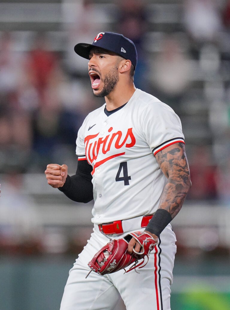
A crisp white style, the Twins wordmark really pops in the bright red across the chest. These are very traditional uniforms, but the pants piping and “TC” logo on the cap are subtle additions that do a lot.
Related: Minnesota Twins City Connect Uniforms Causing Quite the ‘Ripple Effect’ in Reactions
Of course these are full of grass and dirt stains when in action, but as the bright white emerges from the dugout, it screams the Twins are ready to play. No doubt, I wouldn’t be surprised at all if many of you rank this one higher than I did.
2. Road Twins Uniform

A gray offering with pinstripes is something that should largely be synonymous with the Minnesota Twins. While it is the New York Yankees that are known as “The Pinstripes,” the Twins have long had pinstriped uniforms as well.
The gray background is great, and a Minnesota wordmark across the chest in navy looks really sharp. The cap being the new “M” logo isn’t ideal, but not enough to knock these down.
1. Alternate Home Uniform
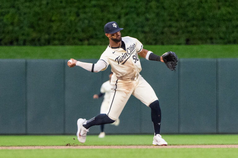
The cream “Twin Cities” uniform has been the gold standard since it was unveiled prior to the 2023 Major League Baseball season. Putting “Twin Cities” as the wordmark on the chest differentiates from other offerings, and bringing back a long-celebrated cream palette is well done.
Paired with the “TC” cap with letters stitched in cream, it’s a clean alternate that isn’t too busy and remains among the favorites in the clubhouse as well. It’s different, but not too different. They really are the perfect alternates.
More About:Minnesota Twins