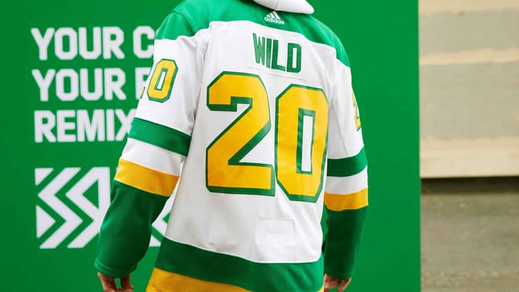
Wild’s New Throwbacks Look Cool, But…

The Minnesota Wild, along with the rest of the NHL, released fresh new takes on retro uniforms on Monday. They’re awesome. Some teams are obviously cooler than others but, overall, Adidas and the NHL killed it with these new throwback threads.
But I’m going to be the Debbie Downer because someone has to be. I want to love the new uniforms but the feeling is just as bitter, as it is sweet… because the logo is wrong and everybody knows it.
New uniforms are cool. Still stupid we can’t wear the north stars logo. pic.twitter.com/JSpAnOjwEz
— Minnesota Sports Fan (@realmnsportsfan) November 16, 2020
Meanwhile, Minnesota Wild retro jerseys are a throwback to the Minnesota North Starshttps://t.co/mrFMOCLDuf pic.twitter.com/2NsLG823ek
— Saad Yousuf (@SaadYousuf126) November 16, 2020
These two are my least favorite of the #ReverseRetro release. The Stars jersey is way way way too bland. And I get the idea behind the Wild jersey but it just don’t look right pic.twitter.com/PQOIsmi3RN
— #PredsPride #TitanUp (@Preds_Pride) November 16, 2020
I want to remind everyone, before getting further into this very controversial subject, that out of all the people and organizations to blame for this travesty, the Minnesota Wild are not it. The Wild came in, after a decade of no pro hockey in the state of hockey, and restored order. They deserve praise.
Bitter-Sweet
You’ll never be able to put this color scheme together and not think about the North Stars in Minnesota. I didn’t grow up as a rabid MN hockey fan but I still know who those colors belong to. They’re too iconic. You see blue/red schemes, red/white schemes, green/white, green/gold, black/gold etc, everywhere. There are a lot of copy-cats around sports, especially when it comes to logos and color schemes.
But nobody, at any major level, has re-created the magic with green/yellow that the North Stars did. That’s part of what makes it so weird to see with a Wild logo where a big upward pointing “N” is supposed to be.
1990: Brian Hayward traded by @CanadiensMTL to Minnesota North Stars. https://t.co/pfWouwFJ5q pic.twitter.com/zhB98o5jNT
— Doug Norris (@GoalieHistory) November 7, 2020
For the love of everything can we please go back to being the Minnesota North Stars. Quit teasing us with the colors and give the people what they want. pic.twitter.com/5IuLXuIJam
— Jimmy Knutson (@JimmyKnutson) November 16, 2020
Lost in history
If the North Stars lacked their iconic symbolism or they weren’t so beloved, with such a storied history in the state of Minnesota, they’d already be lost to the snows of time.
Their move to Dallas all but guaranteed that. When they left, they cut “North” out of their nickname and changed the logo, burying the green and gold deep in the annals of Reunion Arena, along with the “N” logo. I doubt that closet even made the moving list to American Airlines Center in 2001…
Since the Wild aren’t allowed to use the North Stars logo and the Stars want to celebrate their history in Dallas, not Minnesota, we rarely ever see the North Stars “N” reappear. That’s part of the pain.
It’s time for Dallas to sell the “North Stars” copyrights back to Minnesota. Modano’s already come back. We might as well continue the transition. Again, they don’t want OUR HISTORY in Dallas anyway. This should have been done long ago.
ALSO READ: This retro uniform has been hinted at for awhile
Eric Strack | Minnesota Sports Fan
More About:Minnesota Wild
