Minnesota Vikings Logos: From 1960s to Present
The National Football League (NFL) isn’t just a hub of athletic prowess but also a melting pot of cultural representations. From the fleur-de-lis of the Saints to the Nordic-inspired emblem of the Minnesota Vikings, these logos carry historical and cultural significance that resonates with fans on multiple levels.
The Minnesota Vikings, founded in 1960, stand as a testament to the region’s rich history in professional football. Originating from Minneapolis, the team’s inception stemmed from local businessmen being awarded the 14th NFL franchise, marking the start of a storied journey.
Despite remarkable regular-season performances, the Vikings have faced struggles when it comes to championship wins, with only one NFL Championship victory in 1969, a year before the AFL-NFL merger. Despite this, their consistency in playoffs and resilience on the field has garnered a loyal fanbase.
The Vikings logo has remained as consistent as their football product throughout the years. Let’s take a look at how the logo has evolved.
Related: Minnesota Vikings game today: TV schedule, channel, and more
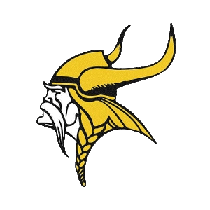
Minnesota Vikings Logo 1961 – 1965

This is the original Minnesota Vikings logo and also the most unrecognizable from the current logo you see today.
The debut of the Vikings’ logo in 1961 showcased a left-facing Viking head, distinct in its design compared to others in the league at that time. Sporting a fierce, weathered face and horned helmet, this logo captured the essence of Norse warriors that the team aimed to embody.
Related: Minnesota Vikings Defense Rankings 2023
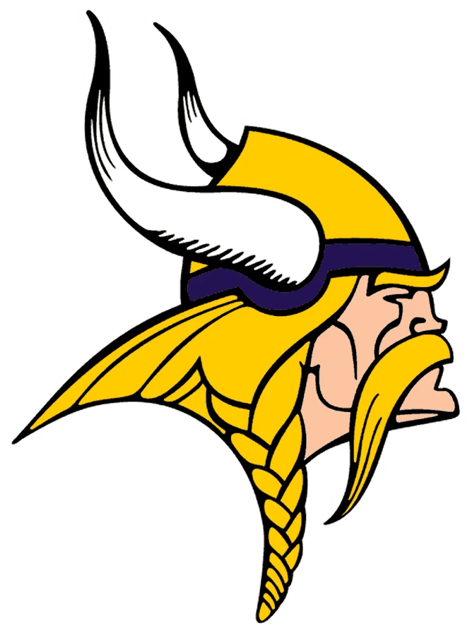
Minnesota Vikings Logo 1966 – 1996

Five seasons after its inception, the Minnesota Vikings underwent a significant logo revamp in 1966. This marked the first substantial change in the team’s emblem since its introduction. The alteration shifted the Viking’s direction from left-facing to right-facing, accompanied by a complete color scheme transformation.
The revamped logo portrayed a Viking in profile, with braided gold hair, a thick mustache, and a determined expression. The Viking donned a purple and gold helmet with more refined and pronounced white horns, enhancing the logo’s overall clarity and visual appeal.
This redesign, while a departure from the initial left-facing depiction, became an iconic representation that endured for three decades, epitomizing the team’s strength and character on and off the field.
Related: NFC Playoff Picture Shines Positive Light on Minnesota Vikings
Minnesota Vikings Logo 1997 – 2001

At first glance, this looks like the exact same logo, but a shift in 1997 aimed to refine the existing design. They enhanced visibility and detail with digital tools. The color palette remained unchanged, primarily focusing on smoothing out the logo’s strokes for a crisper appearance.
Related: 10 Best Minnesota Vikings QBs of All-Time
Minnesota Vikings logo 2002 – 2009

A very subtle logo alteration in 2002 primarily targeted the purple band on the helmet, intensifying its shade for a more regal allure, creating a better visual contrast with the golden-yellow elements.
Minnesota Vikings logo 2010 – 2012

In the 2010 Vikings logo, further modifications were introduced, primarily lightening the purple band while retaining its regal essence, a strategic move for better visibility, especially in darker surroundings.
Related: Vikings in Running for Shaq Leonard; Akayleb Evans Returns to Practice
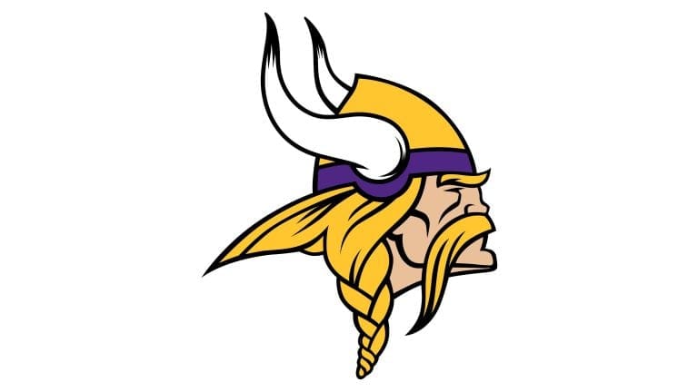
Minnesota Vikings logo 2013 – Present

After the most recent overhaul, the “new” 2013 logo ushered in brighter tones, amplifying the color scheme for enhanced visibility. Notable changes included a beefier appearance of the Viking, thicker horns, and a shift in color balance for a strikingly muscular portrayal.
Related: Sounds Like Kevin O’Connell is Benching Alexander Mattison
New Minnesota Vikings Logo Ideas
The Minnesota Vikings have not changed their logo very much over the years, but that has not stopped NFL fans from coming up with new ideas for the team. Popular TikToker Emily Morgan, who is best known for her logo redesigns, took a stab at it.
The redesign was met with mixed feedback, which honestly shows why the Vikings’ strategy of ‘don’t fix what isn’t broken’ might be a good one.
https://platform.twitter.com/widgets.jsThis logo redesign 🔥👏
— SportsCenter (@SportsCenter) April 5, 2023
(via emilymorgancreates/TikTok) pic.twitter.com/TVxKnmmcvn
Research Guy from Twitter was met with more positive feedback than Emily’s Vikings design idea. His look was still a little too different for some fans, but it was interesting to see a different perspective on the classic logo.
https://platform.twitter.com/widgets.jsHere's my attempts at a @Vikings logo redesign: pic.twitter.com/dM4OWhDtwT
— Research Guy (@ResearchGuyy) April 5, 2023
Related: Justin Jefferson Doesn’t Care About Your Fantasy Football Team
More About:Minnesota Vikings
